iPhone screen displaying a text conversation with a contact named Debbie. The conversation includes messages about a resume, a Google Photos link, a good morning message, and a voice message. The keyboard is visible at the bottom of the screen.
Apple logo on a black background.

Reinventing iMessage’s Voice Memo Feature

Timeline: Sept 2022 - Oct 2022

According to Earth Web, there are over 1 billion iPhone users around the world. With such a large user pool, there has to be something that users find frustrating. In this mini-case study, I will talk about the voice memo feature on the iMessage app.

Project Overview

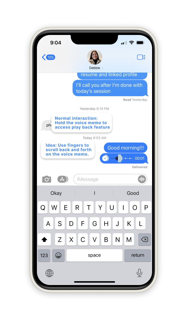
  • Voice message memos are inconveniently hard to navigate.

  • Include a voice memo tracker and extend the message across the screen for scrolling power.

*Before continuing, I’d like to inform you that these changes were made on apple on their latest IOS 16.1.1 update.*

Issue

You can’t navigate through your voice memo like how you would on a music player or recording app. Instead, the user has quite a journey to access the voice memo and allow the user to playback and scroll through the memo.

opportunity

Include a voice tracker on the memo.

A smartphone screen displaying a text message conversation between Debbie and another person. The messages include instructions about voice memo features and a voice message with a play button. The keyboard is visible below the conversation.
Screenshot of a text message conversation on an iPhone, with messages from Debbie and another person, showing links, voice message, and a to-do note about adding a timer/voice memo tracker.
Screenshot of a smartphone displaying a messaging app conversation, with texts and a voice message, among other icons visible on the screen.

Issue

Adding a tracker is nice, but how accurate is the user’s scrolling power? What if the user can’t see very well? How can I design this to meet accessibility standards?

opportunity

I extended the voice memo across the screen, which could be helpful for longer voice messages, giving the user more scrolling power.

Screenshot of a smartphone messaging app showing a conversation with voice messages, text messages, and a profile picture of a woman named Debbie at the top.
Screenshot of a messaging app on an iPhone showing a conversation with Debbie, including voice messages, text exchange that says 'Good morning!!!', and a note about message extension functionality, with a visible keyboard at the bottom.

Issue

When you hold the message, the memo becomes an overly sized mp3 player image. It’s bulky and takes up the entire screen.

opportunity

Replacing the mp3 image, I kept the style of the voice memo consistent with the text messaging look. And then, I incorporated the scrolling feature presented earlier.

A smartphone screen displaying a text message conversation, with a blue message saying 'Good morning!!!' and a context menu with options like Reply, Copy, Translate, and More. Hand-drawn annotations indicate options for reacting with emojis and a caption states: 'This is the normal interaction on a text message.'
Smartphone displaying an audio message with a waveform, sharing a tip about viewing interaction when holding a message, with options to save, reply, copy, or learn more.
A smartphone screen displaying a voice message playback with options to reply, copy, translate, or more, and a speech bubbles with a message at the top. The phone shows a notification bar with 1:00, Wi-Fi, and battery icons.
A smartphone screen displaying a voice message in a messaging app with options to reply, copy, translate, or more. A blue informational tooltip explains the voice feature that replaces tapping or going to a new page to listen to the memo, allowing scrolling to a specific part.

Lessons Learned

Although this was a very quick mini-case study, I learned that even the standard, leading products with over 1 billion users have opportunities of growth and ways to improve products for users to use more efficiently.